The Ghost of Bill Blass - Special to the Cobbfather Post Gazette with the help of Miss Cleo
It's that time of the year again where Nykee releases their special "City Edition" jerseys, limited edition to Season 57. This means it's also time to review them and determine if they are drab, fab, or destined to be confined to the City Edition trashbin of design history.
To help in this endeavor, the Cobbfather Post Gazette has managed to utilize the power of seance and Miss Cleo to contact the ghost of famed fashion designer, Bill Blass, to hear what this legendary fashionista has to say.
Anaheim Diablos
This is a well styled jersey. I greatly enjoy the well executed use of the aggressively styled devil logo while still maintaining the classic scripting for the team name. The offsetting stripes coupled with the colored sleeves is an interesting and visually unique choice. It can be a bit much, especially with the sleeve patch weighting the visuals to the right arm. All told given the history of city jerseys, this turned out well.
Grade: B+
Atlanta Expos
What is this? Did somebody steal Karl Lagerfelds sketchbook, smear a variety pack of McDonald's sauce packets all over it, and then photocopy it for a jersey design? Because that is what this is. The stripes are misaligned, the color palette is to overfull, and even the city skyline looks like somebody cut and pasted the same building ad nauseum. Do better, Nykee.
Grade: D-
Augusta Alcoholics
Grade: C+
Austin Sons of Odin
Now this city edition jersey is exactly what I want to see in a limited edition design. The city name is prominently displayed, and the mascot features in such a way that there is no doubt about the nature of it. The symmetry is well executed in the color scheme, with a nice sleeve tip highlight of the crimson offset color. One could easily see wearing this to the stadium, or to Ragnarok.
Grade: A
Boston Baseball Team
This is from Boston, and it represents a team. Job done, but not in an inspired way at all. It was as if a design intern was told to meet a stripe quota, without any thought as to how they would affect the visual. The more I look at it, the more my ethereal eyes hurt. I can't imagine looking at this if I were color blind.
Grade: C-
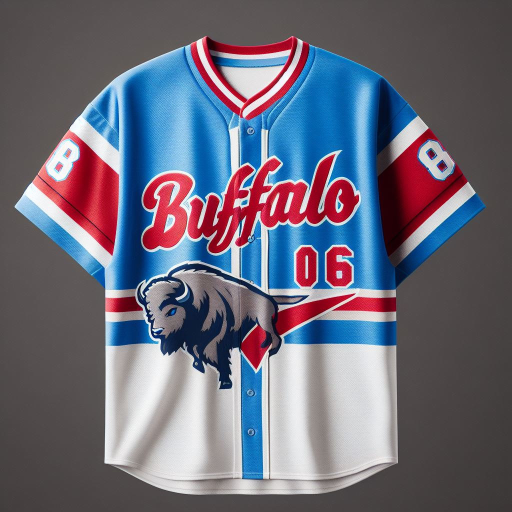
Buffalo Bisons
This jersey looks like Nykee distilled the saddest essence of Scott Norwood's wide right and turned it into a baseball jersey. The football styled numbers on the sleeves gives this jersey the personality of the city, in that they love their football team despite the horrors it continuously inflicts upon the local populace. I do like the buffalo though charging through the jersey, it's a nice touch. Enough to make it marketable.
Grade: C
Charleston Offspring
What happened here. Legitimately I am asking, what happened? This jersey wouldn't look pretty fly on any guy, and strikes me as a poor design choice attempting to merge the very best of Champions League football and 90's alt rock. As one might expect, the look is unflattering.
Grade: D+
Chicago Gunslingers
This is an interesting design choice. I enjoy the double lined pinstripes, and the drawn pistols facing each other as if in a duel at high noon. The font is reminiscent of an old west whiskey bar, with luminaries such as Shane, The Man With No Name, or Wyatt Earp sitting at it. One of the better designs, but still a bit busy in the font.
Grade: B
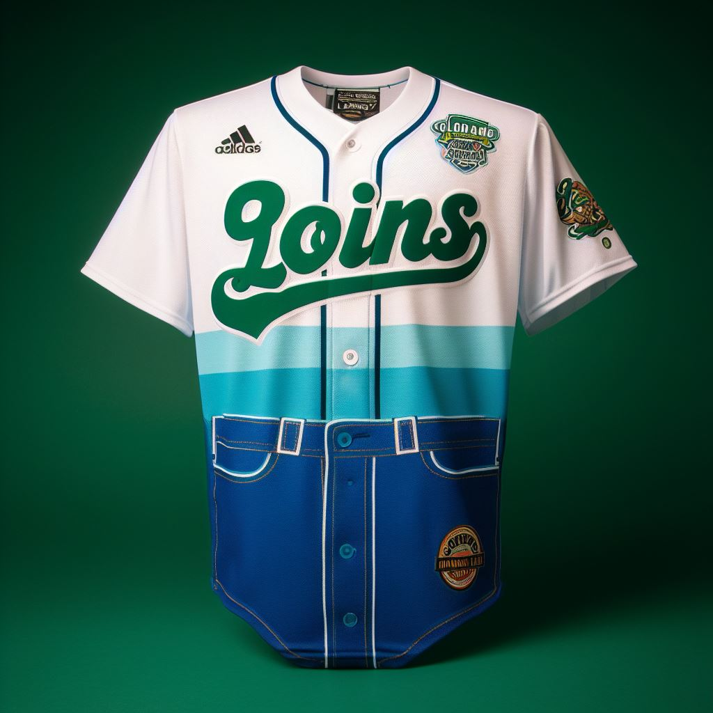
Colorado Springs From My Loins
The only way to describe this jersey is inspired madness. The sharp utilization of the color scheme to fade into jorts, bringing the focus on the jersey to whatever may be springing from the players loins is a stroke of genius. The lettering is sharply underlined, and the jersey look on top is clean. I don't think I could have done it any better were I still alive.
Grade: A+
Columbus Corgis
This is a well done jersey. The coloring is on point, the lettering placed well across the chest, and the corgi logo sitting prominently underneath, but not so low as to look out of place. It's no small feet to illustrate a dog with legs so short in a manner that looks natural. This jersey will never be intimidating but that doesn't matter, as there are legions of fans of kawaii and cute fashion who will be swooning over this jersey. I wouldn't be surprised to see twitch streamers wearing it.
Grade: A
Dover Hazmats
This is a timeless jersey, which is rather shocking to say of a city edition. One might not know it were any different from an everyday jersey were it not for the subtle toxic waste logo upon the sleeve and lower tuck. The striped sleeves are very classy, and almost make the idea of playing with hazardous waste palatable.
Grade: A-
Hartford Rising Stars
I see what the designer was going for here, even if they didn't. Trying to utilize the color scheme to illustrate stars rising up the jersey may have been a good idea, but unfortunately the designer had more trouble spelling Hartford than a 1st grader trying to spell Manolo Blahnik. The jersey is too busy, the pinstripes are drowned by the color fade and the myriad of stars upon the cloth. One o the weaker entries by Nykee this year.
Grade: C-
Helena Hot Dogs
If I am being frank, this jersey isn't fit for any bun. The lettering is way too high on the front, the hotdog looks like clip art, and the colors are bland and uninspired. This jersey is like a Guaranteed Rate field hot dog, once you unwrap it from it's cheap foil, you are just left with disappointment in your hands.
Grade: D
Houston Space Cowboys
Is this a baseball jersey, or a bowling shirt on steroids? Either way, it's most certainly distinctive and there is nothing more Texas than an astronaut in a ten gallon hat. The stars are a bit much, but everything is bigger down there and I suppose that goes for the graphics on the shirt, where two letter S's are needed to make the city name. This is what I expect from Nykee for city editions - insanity mixed with excess.
Grade: B-
Huntington Tropics
When I think of West Virginia, the very first thing I think of is something out of Banana Ball, and that's what we have here with this city edition jersey. It is reminiscent of a Hawaiian shirt that should be worn at a luau by your lazy brother in law who got rich during the dot com boom in the 1990s and has been living the good life ever since. It also looks like the perfect shirt for Wei Yin Wan to recover from his devastating injury in while he watches the playoffs. Thanks, city edition.
Grade: B+
Jacksonville Lizard Kings
Now this is the city edition design I have come to know and love. You would never see Dianne von Furstenburg drop something like this onto a mannequin, let alone a ball player. But that didn't stop Nykee from producing this slice of madness on a jersey. Is there even a jersey here? All I see is the name and logo. Maybe they shouldn't let the interns have access to a zoom function.
Grade: C
Mexico City Staring Frogs
I have looked into the eyes of the frog, and they have looked right back. Nykee captured the spirit of the staring frog with the logo, but I believe the striping on the jersey leaves a bit to be desired. The block color schemes seem lazily implemented, and take away from the logo in the middle. But I will give the designer credit, it's a sharp logo. Solid, but not spectacular.
Grade: B-
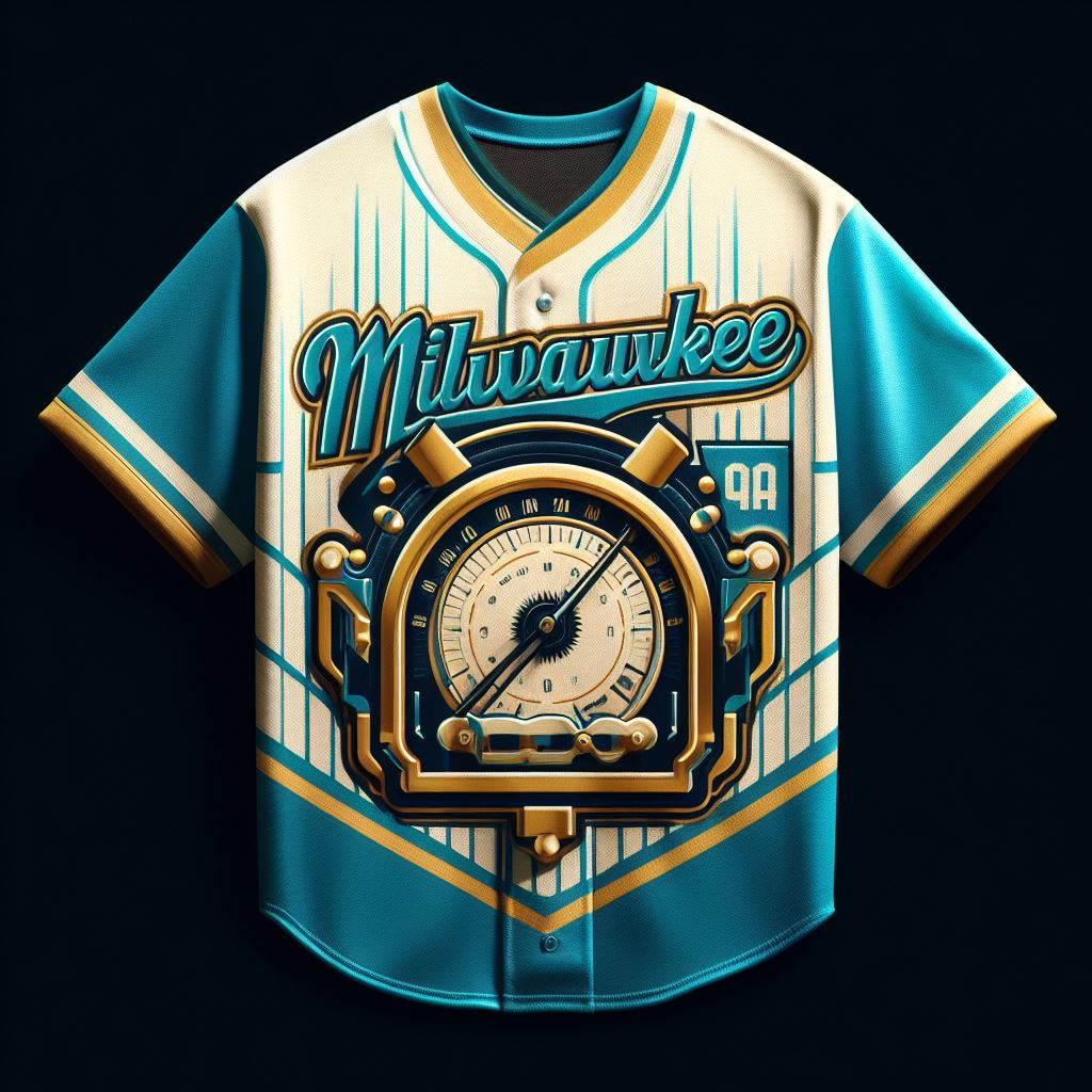
Milwaukee Metronomes
Pierre Balmain would be spinning in his grave if he saw this travesty of a jersey today. I'm spinning in my grave just looking at it! Is that a metronome, a pressure gauge, a speedometer, or the mad steampunk creation of Byron Laurentius Throgmorton the Third? I honestly don't know, but it's nice to see that the numbers are trying to peek out from behind it. Negative marks for taking away from the city name, though being Milwaukee I can see why the may be trying to hide it.
Grade: D+
Minnesota North Stars
For being inspired by celestial bodies (and I don't mean Linda Evangelista or Iman), this jersey is rather lackluster, and shows no inspiration whatsoever. Lazy stripes on the collar, no note of the city itself (a cardinal sin for a city edition!), and a slate gray coloring make this jersey something from the depths of Hades instead of the heavens above. A small point for a single north star on the jersey, but that isn't enough to save this one from being long forgotten when the season is over.
Grade: D
Montreal Fighting Poutine Plates
Grade: C-
New Orleans Hurricane Dodgers
This city edition jersey is a unique design, but not in a good way. What is the point of pinstripes if you deifle them with two horizontal stripes which serve no purpose other than to ruin the pinstripes? THe logo is interesting, a unique take on the hurricane weather symbol with the team name inside. The coloring outside of the poor choice of stripe is well executed. Solidly in the lower middle of Nykee's offerings this season.
Grade: C
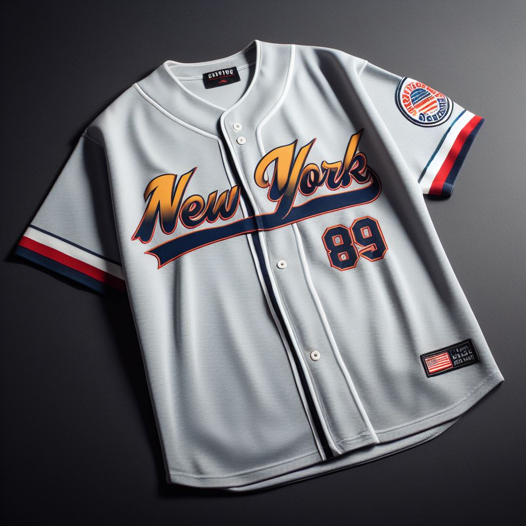
New York Empire
So this is what happens when a fashion designer is inspired by Shea Stadium coupled with the anger of George Steinbrenner. I don't even know what to say about this other than that it looks fine, but for one of the legendary cities, and the home of fashion in the United States, I would expect so much more. At least they aren't Detroit.
Grade: C
Grade: C
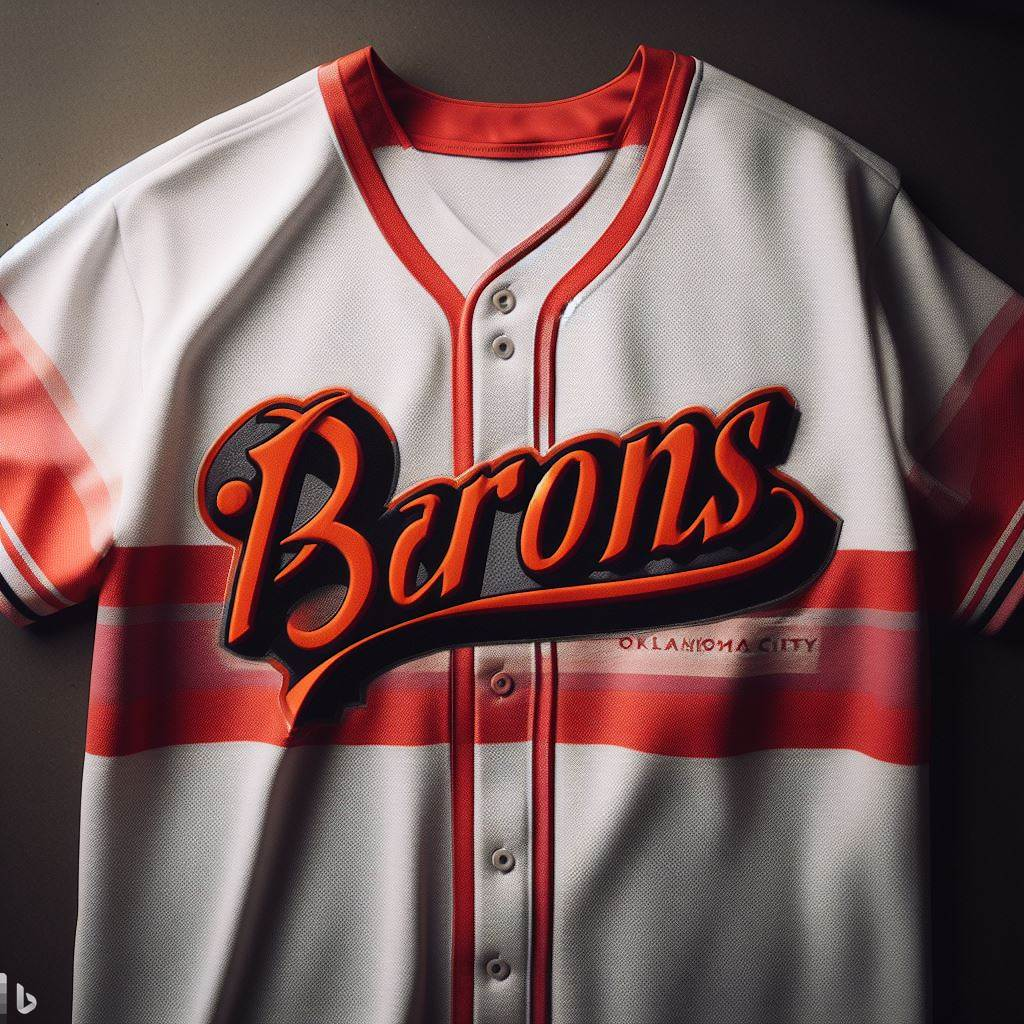
Oklahoma City Barons
Whoever in the Nykee city edition team deemed it a good idea to introduce salmon to the color scheme for Oklahoma City deserves to be thrown off the runway. In combination with the orange logo, this is rather hideous, especially with the cyberpunk reminiscent city name fading into the wildly chromatic stripe. Please, send this jersey to Tommy Hilfiger for rehabilitation, STAT.
Grade: D+
Philadelphia Harpers
I must confess, I do enjoy this jersey. It reminds me of the 1970s, when my designs were highly sought after, and everyone wanted to dress like me. This retro styling will appeal to those in the city of Brotherly Love who yearn for cheap seats, Mike Schmidt, and cheap beer. They did commit the fashion faux pas of bar stripe over pinstripes, but I'll let it slide, just this once.
Grade: B
Pittsburgh Yinzers
If I recall a Yinzer is a self described resident of Pittsburgh. If that is the case I believe this jersey captures the joie de vive of the city residents just perfectly. I enjoy the subtle baseball hidden behind the Yinzer Man, and can just imagine him watching the team on a daily basis.
Grade: B-
Grade: B-
Salem Bourbon Makers
Wow, this is actually a well designed jersey by Nykee, a rarity for city editions! Honestly, I don't know that Paco Rabanne could have done it better. The letter placement is perfect, the numbering classic, and the team name well placed and offset. The shoulder logos are classy, and the coloring is clean. Well done, Nykee.
Grade: A
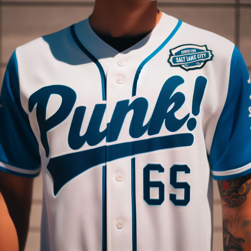
Salt Lake City Punk!
Another jersey that captures the spirit of the city, as nothing says Salt Lake like Punk! The only thing missing from this jersey is a mohawk, but perhaps that will be saved for next years marketing campaign. The lettering, coloring, and numbers are clean, with contrasting sleeves. This is a fine jersey, I have to say.
Grade: A-
Santa Fe Surf Riders VIII
I have no words. Not even in his most demented dreams could Alexander McQueen have crafted something like this. There is no surf. There are no riders. There is just sun and the desert. But, this is the city edition jersey, so anything goes! But even with that, I am stunned, but at least it isn't the earlier design I had heard rumor of which featured a robot cowboy.
Grade: C-
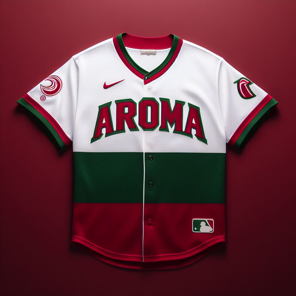
Tacoma Aroma
This must have been the backup design after the original one failed to pass the HBD administrative filters for marketing. But I thought with city editions anything was on the table? Alas what we are left with is block lettering, block stripes, but perhaps a hint of aroma with the sleeve patches. I don't want to say Tacoma is a boring city, but this jersey does it no favors. Perhaps next season instead of Nykee they can hire Jimmy Choo.
Grade: C
Tokyo Nomo
This is a well done jersey, in my opinion. Block lettering for the city, cursive with the slash for the Nomo name, featured prominently across the chest. The coloring contrast is well executed, and is distinctive on the field of play. A solid entry, if a bit conservative in execution.
Grade: B
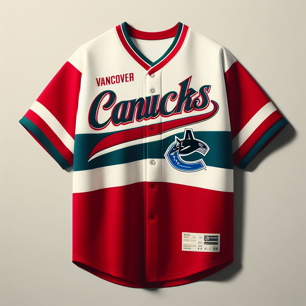
Vancouver Canucks
Clearly Nykee designers have no fear for copyright infringement with the use of this logo for their teams jersey. But maybe that is also because the team management spent all their money on player payroll and kickbacks to the commissioners office to subsidize a graphic design department. But with all that said this is still a solid jersey, visually speaking, even if the logo is a bit out of place.
Grade: B-
Washington DC Nationals
Wow, there is a lot going on with this jersey. The lettering is crowded, the stripes are going both ways and are multicolored and incomplete, and the sleeves are contrast block colored. It's visually a mess, but I suppose if it is being worn by the pitcher that is intentional as opposing batters will have a hard time focusing looking at this amalgamation of design on cloth.
Grade: D
That wraps up this season's city editions. If this is what was offered in the name of fashion in 2023, I hope Miss Cleo doesn't bring me back from the grave for whatever is coming next. But until then, stay classy!
--Bill


